Key point of post




February 2014 was the driest since 1990 and in the top 5 warmest
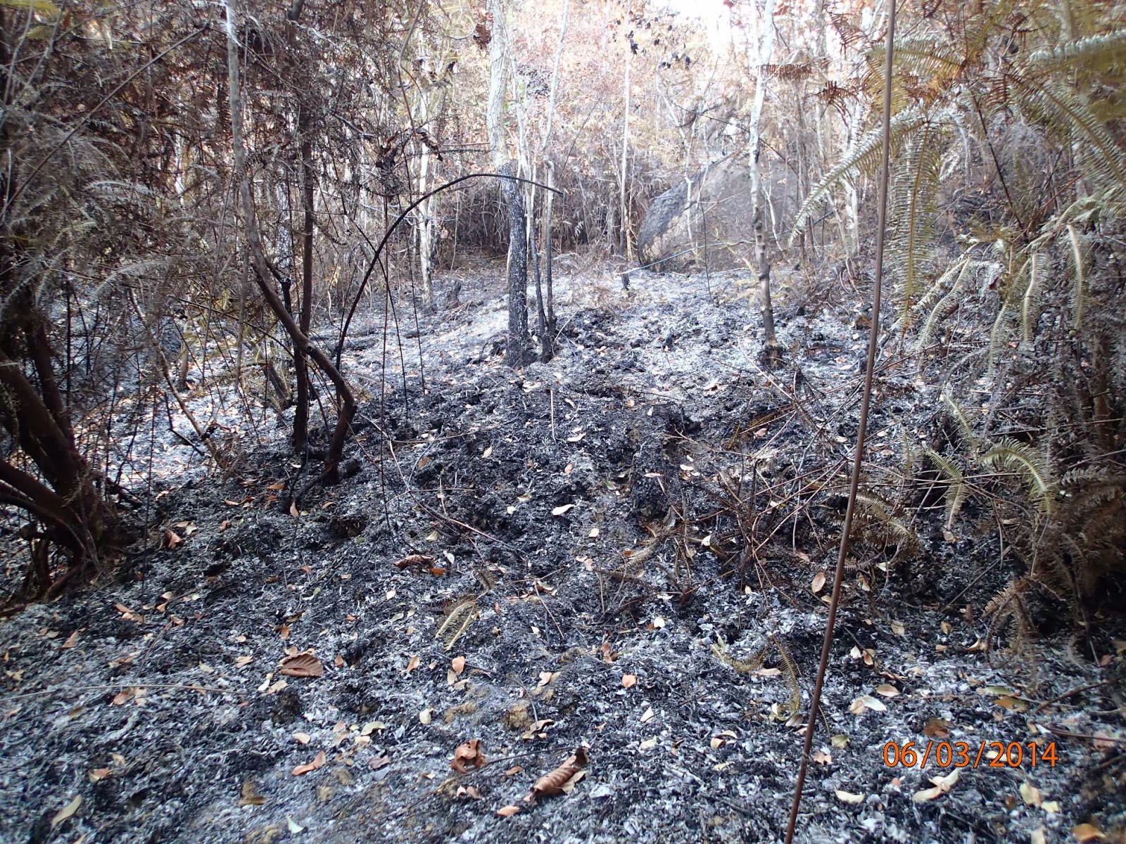
Further down south on the steep slopes of Bukit Jambul, there are recurring fires at various patches along the hills. The photo below was taken a few nights ago showing the fires on the hills just behind the Bukit Jambul High School and it has yet to cease entirely since this post was created.

As we’ve seen in previous post, while there is some ‘predictable’ seasonality in rainfall on Penang, it is also rather erratic or variable. We’ve plotted daily total rainfall at Penang Airport, below, for 7 selected years, and the first 2 months of 2014. These years give an illustration of some typical patterns. Generally speaking December, January and February are indeed quite dry but this is not always true. January 2000 and February 2005 were, for example, quite wet; early February 2005 seeing greater than 50mms rain in one day.

So what about 2014? There was a bit of rain in mid-January (at least at the airport) but none fell at all in February. Total February rainfall (blue line) since 1990 is plotted below, together with average daily air temperatures for February (red line). February 2014 was the driest for nearly 25 years but not by that much. Februaries 1995 and 2001 were also very dry. [Data for further back in time were available but incomplete records and lines of zeros made us suspect their veracity.]
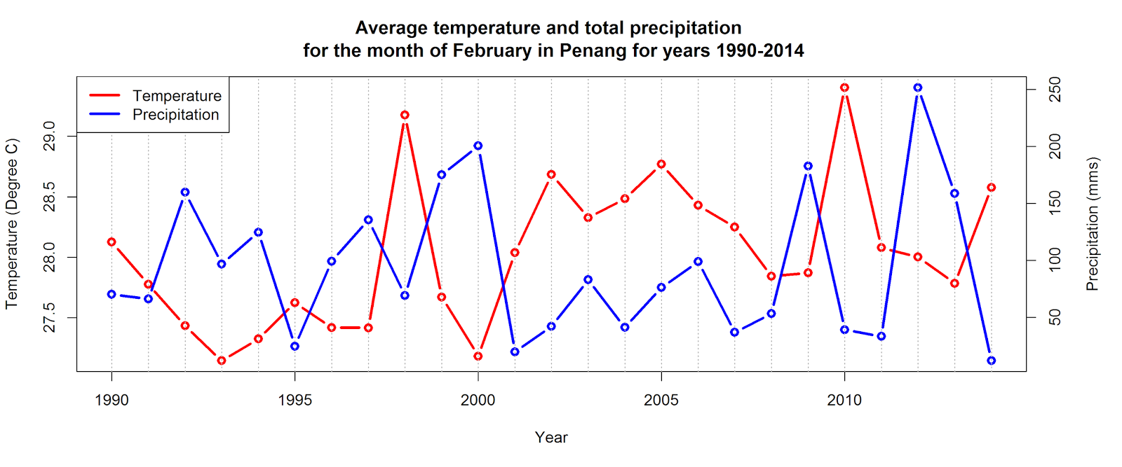
Perhaps then higher temperatures than usual have exacerbated the low rainfall situation and helped stoke the forest fires? Previously we demonstrated that temperatures have been rising in Penang over the last 20 or so years and the hot period of the year now lasts longer than in the past. February 2014 was pretty hot at around 28.5°C, but nothing like as sweltering as 2010 when a mean temperature of around 29°C was recorded, together with also quite low rainfall.
So what of the connection between temperature and rainfall? The average February temperatures and rainfall 1990-2014 are plotted against each other below. There is obviously a negative relationship between the two (the correlation coefficient = -0.4). Wetter Februaries tend to be cooler and vice-versa.

February 2014 has been the driest since 1990 but not the hottest (1998, 2002, 2005, 2010 were all warmer). In summary the relationship between rainfall, temperature, and the triggers for forest fires are complex. Other factors that we have not examined such as humidity and wind speed may also have contributed.
Nevertheless we have shown that February 2014 has been the driest since 1990 on Penang Island and is in the Top 5 warmest years.
As usual, we include the R code we have used to produce the plots in this post. The raw data for these plots however was downloaded from the Global Surface Summary of the Day (GSOD) which is a product developed by the National Climatic Data Centre (NCDC) based in the US. The input data used in building these daily summaries are the Integrated Surface Data (ISD), which includes global data obtained from the USAF Climatology Center, located in the Federal Climate Complex with NCDC. The latest daily summary data are normally available 1-2 days after the date-time of the observations used in the daily summaries.
The datasets can be downloaded from NCDC via a normal web interface at the link below
http://www7.ncdc.noaa.gov/CDO/cdoselect.cmd?datasetabbv=GSOD
or through their FTP site at the following link
http://www7.ncdc.noaa.gov/CDO/cdoselect.cmd?datasetabbv=GSOD
or through their FTP site at the following link
# Setting work directory

setwd("d:\\ClimData")

list.files()

# Reading and reformatting raw data downloaded from NCDC

dat<-read.table("CDO2812586929956.txt",header=F,skip=1)

colnames(dat)<-c("stn","wban","yearmoda","temp","tempc","dewp","dewpc","slp","slpc","stp","stpc","visib","visibc","wdsp","wdspc","mxspd","gust","maxtemp","mintemp","prcp","sndp","frshtt")

dat$yearmoda <- strptime(dat$yearmoda,format="%Y%m%d")

min.date <- min(dat$yearmoda)
max.date <- max(dat$yearmoda)

dat$prcp <- as.character(dat$prcp)
dat$prcp1<- as.numeric(substr(dat$prcp,1,4))
dat$prcpflag <- substr(dat$prcp,5,5)

dat$rain  <- dat$prcp1*25.4
dat$tempdc <- (dat$temp-32) * (5/9)

dat$rain[dat$rain > 1000 ] <- NA

dat$year <- as.numeric(format(dat$yearmoda,"%Y"))
dat$month <- as.numeric(format(dat$yearmoda,"%m"))
dat$day <- as.numeric(format(dat$yearmoda,"%d"))

# Plotting precipitation for various years in Penang from daily precipitation data

library(ggplot2)
library(scales)

dat$date<-as.Date(dat$yearmoda)

datsub <- subset(dat, year == 1990 | year == 1995 | year == 2000 | year == 2005 | year == 2010 | year == 2012 | year ==2013 | year == 2014)

dat1 <- transform(datsub, date = as.Date(paste(2000, month, day, sep="/")))

boxplot.title = 'Precipitation in Penang'
boxplot.subtitle = 'Data source : Federal Climate Complex, Global Surface Summary Of Day Data Version 7'

g <- ggplot(dat1, aes(date, rain)) +
  geom_line(col="blue", size=0.65) +
  facet_wrap( ~ year, ncol = 2) +
  xlab("") + ylab("Precipitation (mms)") +
  scale_x_date(label = date_format("%b"), breaks = seq(min(dat1$date), max(dat1$date), "month")) +
  scale_y_continuous(limits = c(0,150)) +
  ggtitle(bquote(atop(.(boxplot.title), atop(italic(.(boxplot.subtitle)), "")))) + theme(plot.title = element_text(face = "bold",size = 16,colour="black")) +
  theme(legend.position = "none") + theme_bw()
g

ggsave(g, file="Penang_GSOD_Prcp_Plots.png", width=10, height=7)

# Plotting Average monthly temperature and total precipitation

avgtemp <- aggregate(tempdc ~ year + month, data = dat, FUN = mean)
totrain <- aggregate(rain ~ year + month, data = dat, FUN = sum)

avgtempfeb <- subset(avgtemp, month == 2 & year >= 1990)
totrainfeb <- subset(totrain, month == 2 & year >= 1990)

par(mar=c(5,4,4,5)+.1)
plot(avgtempfeb$year,avgtempfeb$tempdc,type="b",col="red",lwd=3,xlab="",ylab="")
par(new=TRUE)
plot(avgtempfeb$year,totrainfeb$rain,,type="b",col="blue",lwd=3,xaxt="n",yaxt="n",xlab="Year",ylab="Temperature (Degree C)",
     main = "Average temperature and total precipitation \n for the month of February in Penang for years 1990-2014")
axis(4)
mtext("Precipitation (mms)",side=4,line=3)
abline(v=1949:2014,lty=3,col='grey70')
legend("topleft",col=c("red","blue"),lwd=3,legend=c("Temperature","Precipitation"))

dev.off()

# Plot correlation between average temperature and total precipitation

png(filename = "Penang_TempPrcp_Correlation_Years_1990-2014.png",height=5,width=10,
    bg = "white",units='in', res = 300, family = "", restoreConsole = TRUE,
    type = "windows")

reg <- lm(totrainfeb$rain~avgtempfeb$tempdc)
plot(avgtempfeb$tempdc,totrainfeb$rain,type='n',xlab="Temperature (Degree C)",ylab="Precipitation (mms)",
     main = "Correlation between average temperature and total precipitation \n for the month of February in Penang for years 1990-2014")

abline(v=c(27.5,28,28.5,29,29.5,30),lty=3,col='grey70')
abline(h=c(0,50,100,150,200.250,300),lty=3,col='grey70')
text(avgtempfeb$tempdc,totrainfeb$rain,as.character(totrainfeb$year),cex=1.2,col="red")
box(lty = "solid", col = 'black',lwd=3)

# Correlation value between total precipitation and temperatures

cor(totrainfeb$rain,avgtempfeb$tempdc)

dev.off()


